How to create a member-only paid community (of No-Coders)
Published on June 15, 2021
Online communities are becoming increasingly popular. Social media platforms like Twitter, Facebook, and Instagram have effectively captured much of their addressable market (in Western countries). But these platforms lack specificity. That's where online communities come in. Online communities are groups of people that organize themselves around a specific topic. In this article, you're going to learn how to build a gated community using Softr.
There are many different ways to build a community. We're going to create a community with both free and paid resources. All users with an account will be able to access the free resources, but we'll also create a paywall using Stripe to set up a premium membership.
In this article, we're going to create a community with training for no-code tools (free resources), and no-code jobs (paid resources).
We've created a template alongside this article, allowing you to set up a paid community faster. See a preview of the template here. You can also follow the steps in this article, and learn the ins and outs of Softr. We recommend you read the entire article, so you'll have a firm grip on how your membership site works.
To optimize for building speed, we've tried to batch tasks that are similar as much as possible. However, this means that there are a couple of things that we'll do twice. We'll take the following steps to create our membership website:
- Create databases
- Set up Softr
- Create pages
- Link everything up
- Test the website
- Update content
- Publish your website
Create your databases
If you don't have a database yet, you can use our template.
Our template consists of the following tables:
- Training (free resources)
These are the free resources we'll show on the website for logged-in users. Whenever we mention "training", we're referring to the resources that should be available to logged-in users.
- Jobs (paid resources)
These are the resources we'll show on the website to paid member users. Whenever we mention jobs or job, we're referring to the resources that you'd like to put behind a paywall.
- Users
This database holds basic info about users.
If you've opted to work with your own database, make sure it includes the following:
- A table for paid resources and a table for free resources. Every record should at least have a Name field. Other fields might include:
- Description
- Link
- Image
- Tags
- A table for users with an Email field. A Name field is optional but recommended.
Set up Softr
With our databases set up, we're all set to head into Softr. First, create a new project from scratch. Then, connect your Users table. Go to settings → integrations → Airtable. Follow the instructions and enter your API key. Then, head to the Data tab in the sidebar. Hit Connect with Airtable and complete the steps. We've now connected Airtable with Softr. Your users their passwords will be kept securely in Softr. Their emails will be used as 'connectors,' and will allow them to log in.
The payment flow
There are two ways to enable payments in your Softr app:
- Embedding Stripe within Softr on a Pricing block
- Redirecting users to Stripe with a Checkout block
In this article, we've opted to redirect users to Stripe using the Checkout block.
Follow the first two steps of this article on our help doc that shows how to set up and integrate Stripe with Softr. Go through the following checklist to make sure you've set Stripe up properly:
- Enable Checkout on Stripe Side
- Enable Checkout on Softr Side
- Enter publishable key
- Enter the secret key
Create pages
With our databases and integrations done, we're ready to move on to creating the pages of our community website. Before we dive in, there are a few important things to understand.
First, we need to talk about user roles. There are various types of users (i.e. roles) that will visit your website:
- All users
- Non-logged-in users (guests)
- Logged-in users
- Paid members
For many pages, the role of the user dictates what should be shown on a page. For example, if a non-logged-in user visits one of the pages that hold your resources, they shouldn't see those resources. Instead, they should be prompted to sign-up for the community, or even to become a paid member. To do this, we're going to make use of a feature in Softr that allows us to edit the visibility of blocks and pages based on the role of the user. For each page and block, we'll let you know what visibility settings we think to make sense.
Ultimately, we'd like our website to have a good copy and design that effectively converts users to become paid members. We recommend focusing on the development of the pages first and take care of the content and design later. Quickly note down your awesome copy idea when inspiration strikes, but don't spend too much time on it just yet.
The Home Page
When starting a new project in Softr, the home page will be created by default. The goal of this page is to convince visitors to sign-up and become a paid member of our community. It will contain sections that explain who the community is for, as well as a pricing block that points users to a separate checkout page.
In addition to the conversion of website visitors, the home page will also hold our header(s) and footer. In Softr, changes to the header or footer have to be made from the home page. New pages will automatically contain those headers and footers. You can create separate headers for pages as well.
The headers
We'll create two separate headers. One for guests, and one for users that are logged in.
Header for guests
To add a new block in Softr, click Blocks in the sidebar. Most block categories have multiple block variations. You're free to pick any variation that you think best suits your website. If we think there's a good reason to pick a specific block, we'll let you know.
It's good practice to have a CTA (Call To Action—a button that you'd like users to click, e.g. 'Get started' or 'Create a new account') in your header so that users can easily find it. Let's pick a header variation that contains a CTA so that it's easy for the user to sign-up.
By default, the header will come with a few links. Since the primary goal of the header for guests is to get them to sign-up/in, we've configured our header to have just one link (sign-in) and one button (become a member).
Of course, we should configure the link and button to take the user to the relevant page. However, since those pages don't exist yet, we'll do the configuration of the actions at a later point.
The configuration of our block looks like this:
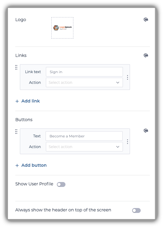
Finally, let's make sure this block is only visible to non-logged-in users. Select the block, and click the eye icon on the top right corner to edit its visibility settings. Then, edit its settings so that it's only visible to non-logged-in users.
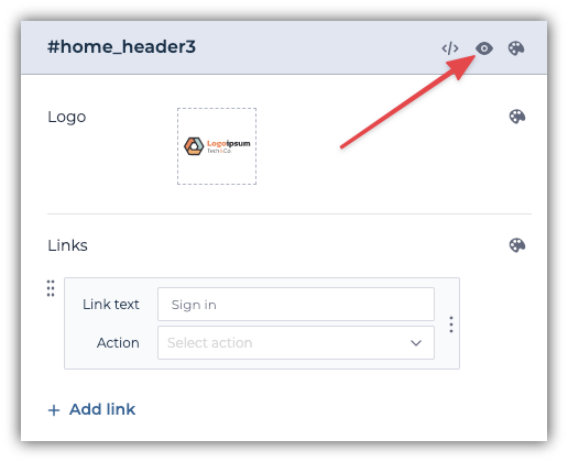
You can read more about block visibility here.
The header for logged-in users
Logged-in users might want to change their password or log out at some point, so let's pick a header that has a profile icon. This header will contain links to member-only resources. In our case, those resources are found in the Trainings and Jobs databases. Remove any unnecessary links.
There should be one link under the profile picture: Sign Out. The Sign Out action is configured automatically.
This block should only be visible to users that are logged in. In the block's visibility settings, hit the button for logged-In users.
Hero section for guests and logged-in users
The hero section is located right below the header on a website. Located at the top of the page, it's usually the first thing visitors see. Because it's so attention-grabbing, the hero section often contains a call-to-action (CTA). It makes sense to change the CTA with the user role.
Pick any hero block with a CTA and configure the CTA button's text to read something like "Become a member". Then, edit this block's visibility so that it only shows for non-logged-in users.
Duplicate the same hero section, and change the CTA text to "Become a paid member". Configure the visibility settings to show only for logged-in users.
Features
The feature section contains a summary of the unique selling points (USP's) of your community. Pick a feature section block that suits your needs. There are no additional configurations to make for this block. The content for the feature section will come later.
Testimonials
Social proof is the natural human tendency to copy the actions of a group. It is one of the '6 Weapons of Influence', and an incredibly effective sales tactic. Our testimonial section will contain endorsements by current paid members. Pick a testimonial block that you like, and let's move on to the next section.
Pricing
Visitors can now understand the value of your community through the hero section. Hopefully, the features and testimonial sections will convince them to become paid members. Let's allow them to do so. Pick a pricing block that best reflects your business model. We want our community to have only one payment plan, so we went with the Single pricing card with details block.
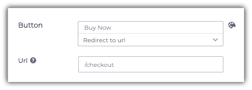
Let's immediately change what the pricing section's CTA button does, this will come in handy later. Change the action of the Buy Now button to Redirect to the URL. We're going to point it to the URL of our (soon-to-be-made) checkout page. You don't need to write it out fully (https://yoursiteurl.com/checkout), just /checkout is sufficient. It should look like this:
FAQ
If your visitors still aren't convinced or have questions after reading the home page, an FAQ section might help them. Pick an FAQ block that best suits your website. We won't go into any further configurations for this block.
Footer
The final element of the homepage is the footer. It generally contains general information like copyright, sitemap, privacy policy, terms and service, and social media. Pick a footer block that you like. We'll configure the links to the pages at a later point. If you already know what pages you want to include in your footer, you can give the existing links the correct names. We will configure the links' actions after we've created all pages.
Sign-up
To become a (paid) member of your community, users will need to sign-up. Let's create a page where they can enter their name, email, and password. To create a new page, use the Pages menu in the sidebar, hit + New Page at the bottom, name the page 'Sign-up'. Adjust the URL of the page if you want. By default, Softr will create a URL that corresponds with the name of the page.
As you can see, our newly created page already has the headers and footer we've created on our home page. Let's add a sign-up block to the page, Blocks > User Accounts > Sign-up form. Configure the block to your liking. At the bottom of the block's configuration, make sure to set the Page after Sign-up to the home page. Since we haven't created a sign-in page yet we can't yet link to it from this block. We'll revisit this block later to fix this.
It would take a programmer days to code an accounts manager. Fortunately, Softr handles all of this for us. We can add features like sign-up, sign-in, and password reset by using user account blocks.
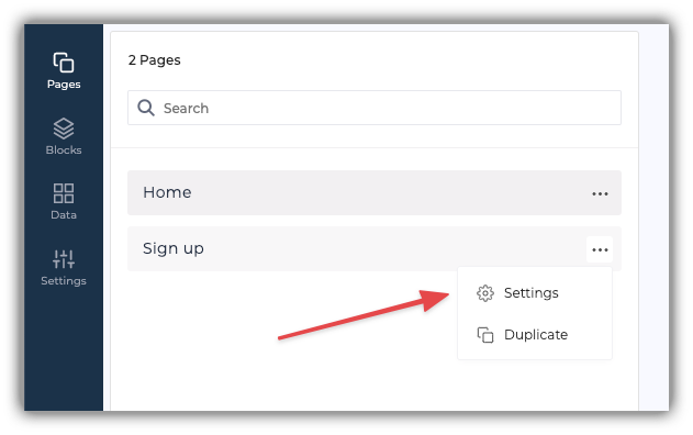
Just like with blocks, you can adjust the visibility of pages. For example, we don't want logged-in users to be able to sign-up again. To prevent this, we have to configure this page accordingly.
- To adjust a page's visibility, click on pages (in the sidebar). Select settings in the three-dot menu. Under visibility change it to non-logged-in users.
Sign-in
This page will allow users with an existing account to sign-in to your community. Add a new page, call it sign-in, and edit its visibility settings to show only for non-logged-in users.
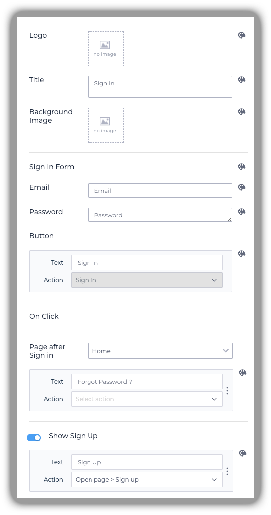
To enable users to log in to your website, add a sign-in block. Select Home as the 'Page after Sign in' to redirect users to the home page after logging in. We'll configure the Forgot Password button later. For now, under the action of the Sign-up button, add an action to open the previously created Sign-up page.
Your configured sign-in block should look like this:
Forgot password
Sometimes, people forget their passwords. That's why we'll create a page that allows users to reset their password by entering their email. By using the Forgot Password block, Softr will take care of all of the technical stuff. The only thing you need to do is add it to the page, and configure it to your liking. Set the visibility settings of this page such that users that aren't yet logged-in can only see it.
Checkout page
When visitors want to become a paid member, they use a checkout page. This page guides users through a payment flow connected to Stripe. When the payment is successful, users will automatically get access to the paid content. We have yet to create that content, but let's focus on the checkout first.
Create a new page named checkout and make sure that the URL of the page is /checkout.
As with the home page's hero section, this page will show different things based on the role of the user. That's why the page should be visible to all users. Here's what blocks this page should contain and what their visibility settings should reflect:
- Sign-up block → If the user hasn't signed up yet
- Payment block → For logged-in, non-member users
- CTA block → To inform paid members that they've stumbled upon a page that is no longer relevant to them
Sign-up block
All paid members need an account, so the checkout page should include a sign-up button for visitors who don't yet have one. After completing a purchase, Softr will automatically associate the user's account with the subscription.
Add a sign-up block to the checkout page. Configure the block to your liking, but make sure to set the Page after Sign-up to the checkout page, so that the user is able to complete the purchase after signing up.
Edit the block's visibility settings so that it only shows for non-logged-in users.
Users who want to become a paid member and already have an account should be able to sign-in, instead of creating a new account. As with the sign-up button on the checkout page, we want users to return to the checkout page when they finished signing in to their account. We'll create a separate page for that in a minute.
Payment block
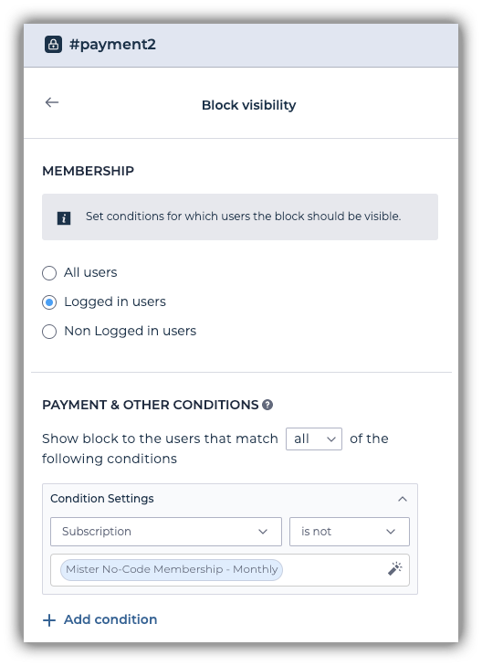
Add the Simple Checkout form block that's located under the Payment tab. This block should be visible only to users that are logged-in but haven't become paid members yet. Let's configure it accordingly.
A few things to note about this configuration:
- It's been configured to match all of the conditions
- Our website offers a subscription, so we've opted for the subscription product
- We're checking whether the subscription is equal to the subscription product that we've created in Stripe.
If all went well, this block's visibility settings should look like this
Now that we've set up this block's visibility, let's configure its contents. Please note that changing the text of this block will only change it on Softr. Editing the price or description will not update your product on Stripe. It's important that you make sure the pricing and interval of your Stripe product correspond with the product description on Softr.
It would be nice to redirect new customers to the paid content. We'll cover how to set this up later.
CTA block
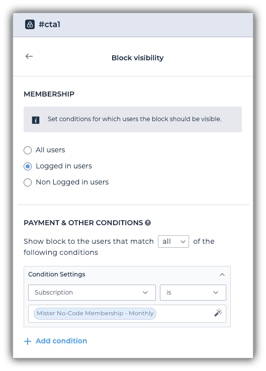
In software development, it's good practice to think about edge cases. Hopefully, paid members won't visit the checkout page. If it does happen, we need to handle it properly. Let's add a CTA block that we'll configure to inform the user that they already have a membership. We'll link the button of this block to point to the page with paid resources later. For now, let's configure the button to say something like Back to paid content. This block should only be visible to paid members.
The visibility of this block should look like this:
Checkout (sign-in) page
As mentioned earlier, some users who want to become paid members already have an account. When they go through the checkout flow, they should have the ability to sign-in, instead of sign-up.
Fortunately, we can link from the previously created checkout page to the sign-in page we're about to create. The big difference between the existing sign-in page and this one is that the existing sign-in page redirects the user to the home page after signing in. This one will redirect the user back to the checkout so that they can continue the checkout process.
Create a new page and set its visibility to non-logged-in users. Add a new sign-in block. The Page after Sign-in should be Checkout. The Sign-Up button should link to the Checkout page as well.
Trainings overview
The trainings overview page contains the resources that will be available for free but require an account. It will list some basic information about each of the records that are in our Airtable Trainings table. However, if a non-logged-in user visits this page, they should be prompted to create an account.
Let's create a new page. Since we're going to show different things within this page based on the user's role, we don't need to edit the visibility settings of the page itself.
First, add a sign-up block. This reduces friction for non-logged-in visitors to sign-up. Instead of creating one all over again, let's copy the sign-up block from the sign-up page. Go to the sign-up page, hover your mouse over the sign-up block, hit Copy to another page, and select the Trainings page.

Don't forget to configure its visibility settings so that it only shows for non-logged-in users!
Great, you've arrived at the core of your website. With all the so-called boilerplate out of the way, you can focus on the essence: displaying the data from your Airtable base.
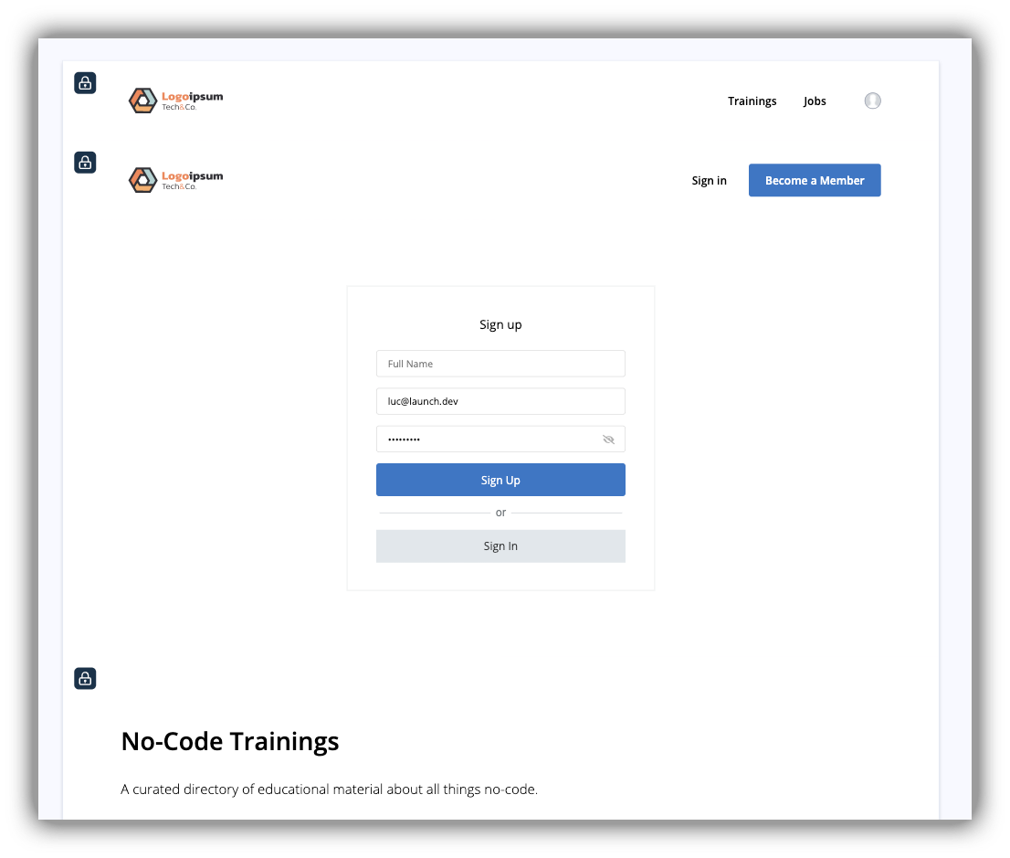
Let's give users some context about what this page is for by adding a CTA block. Remove the button since we don't need that. We'll write the text later. Don't forget to change the visibility of this block. It should only be visible to logged-in users.
Our Trainings page now looks like this:
Add a list block that fits your database. Since we don't have images in our database, we've gone with the List with horizontal cards and visible button block. The configuration of this block is important, so take the time to set everything up properly. Go through each of the inputs one by one and configure it to your liking.
Here's how we've configured our block:

A couple of things to keep in mind:
- For the block we've chosen, Softr has an inline filter applied by default. We've opted to remove it because we don't have any tags to filter our data on. If you're using tags in your database, you'll want to configure the filter so that it filters on your tags.
- If you're using a search box, make sure to have it search in the relevant fields of your table. In our case, that's the description and name of a training.
- Since we don't have images in our database, we've disabled the images. The same goes for tags. If your database has either of these properties, feel free to keep them on, and configure them accordingly.
- We've chosen not to work with a button on the cards. Instead, we're going to work with the on-click feature. This will allow a user to click anywhere on the card and be taken to that specific training. We'll configure this on clicklater.
After you've configured your block, make sure you run through it one more time to check whether everything's right. Finally, edit the visibility of the list block. Once again, it should only be visible for logged-in users.
Training detail page
When a user is interested in one of the trainings they might want to read more about it. The training detail page contains the data of the records in your Airtable base. This is a dynamic page, meaning that Softr will pull the data from your Airtable base and automatically populate it in the design you've laid out. In other words, no need to create a single page for every record in your table.
This page should be visible to all users. As with the Trainings page, we want to persuade users to sign-up for our community. Repeat the same steps to copy over the sign-up block (from the sign-up page). Don't forget to configure its visibility settings in the same way.
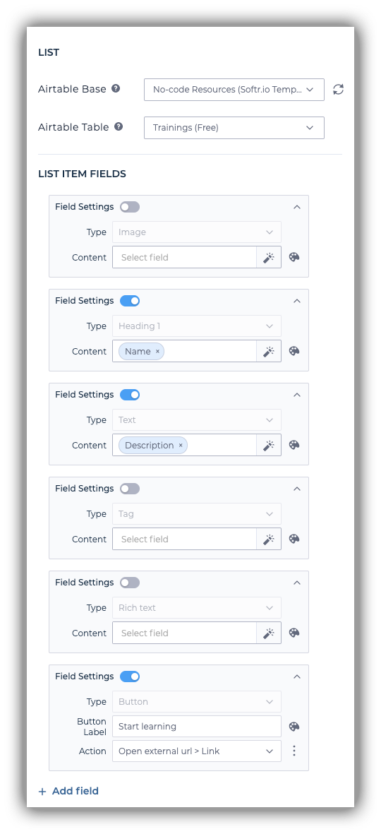
It's time to display the data of your records. Find a block in the list details category that suits your data, and add it to the page. We'll use this block to display the content of our database records. Configure this block to show the relevant data on the page.
If your data contains a link to an external URL, make sure to attach an action to the button that will take the user to this link. Our configuration looks like this:
Make sure to edit the visibility of your list block to show it only to logged-in users.
Jobs overview
In the gated community we're building, the Jobs page will hold the gated content. This is the data that paid members will get access to.
Even though only paid members get full access to the jobs overview page, we can show a pricing block to help them understand the benefits of becoming a paid member.
Head back to the pricing block on the home page. Hit Copy to another page and select the Jobs page. Because we've set up the button URL earlier, we don't need to do that again. This block will prompt non-logged-in users to become paid members. So, make sure to show it only to non-logged-in users.
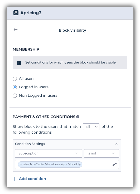
But what if a logged-in user visits this page? To handle that, duplicate the previously created block, but only show it for Logged-in users that aren't paid members.
This block's visibility settings should look like this. Notice that it checks whether the user's subscription status is not equal to our membership product.
We'll also add a CTA block that explains what this page is for.
Like the Trainings page, you'll need a List block to display your data on this page. Find one that fits your data, and edit its visibility so that it's only visible for paid members. Repeat the steps of the previous block to ensure that.
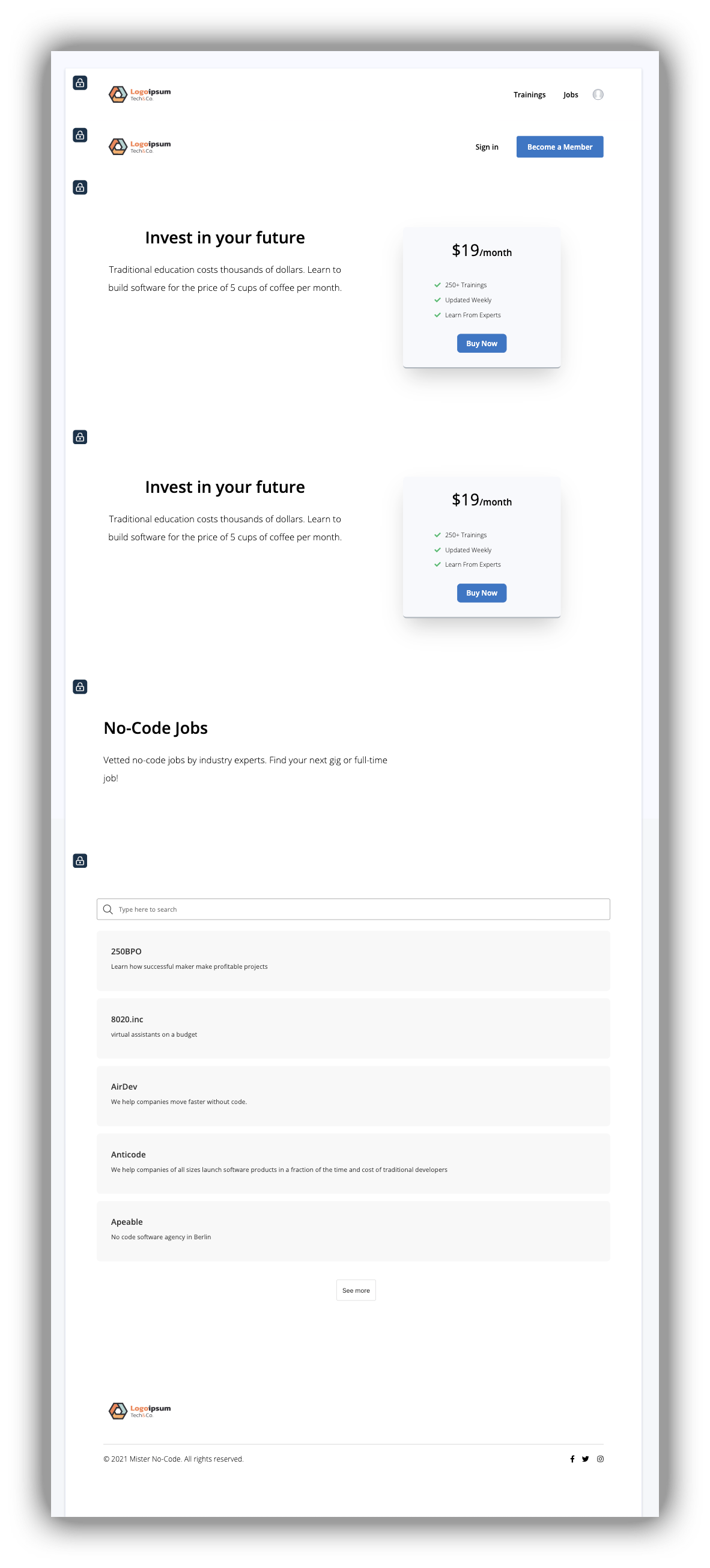
The Jobs page now looks as follows:
Job detail page
Like the Training detail page, this page shows the details of a record in the Jobs table of our Airtable base. Once again, you should display the benefits of the membership so non-members can better choose whether they want to become a paid member.
Let's save some time by copying both pricing blocks we've created on the Jobs overview page.
As with the Training page, we're going to use a List detail block to display the data of a single job. Add a block that presents your data well and configure its visibility settings so that it's only visible for logged-in users.
Again, configure the list details block such that it's only visible to paid members. You can replicate the same steps we've taken on the Jobs overview page to do this.
401 Unauthorized page
As we've mentioned, it's good practice to think about the edge-cases of your website. Ultimately, some users will end up on a page where they don't belong. For example, if a page's visibility is set to show only for logged-in users, but a non-logged-in user visits the website, they will be 'redirected' to a so-called 401 page. This page informs the user that they're unauthorized to view the contents of the page they tried to visit.
Create a new page, but make sure that the URL of this page is: /401
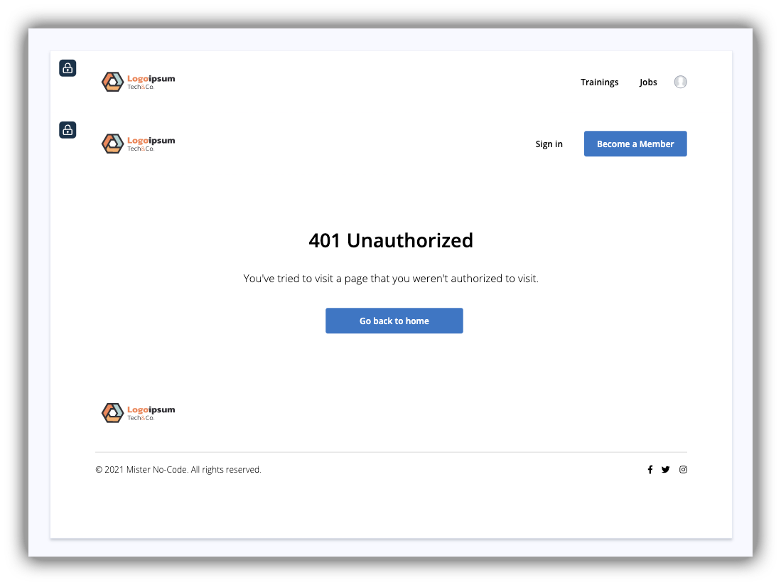
Add a CTA block of your liking. CTA blocks are useful in this case because they contain a button that we can use to direct the user back to the home page. For the text, we simply used "You've tried to visit a page that you weren't authorized to visit." Configure the button so that users are redirected back to the home page when they press it.
This is what our 401 page looks like:
Link everything up
Because we've opted to create the pages one by one, there have been a few elements we were unable to link up immediately. Let's walk through those to make sure our website is completely functional.
Home
Hero Sections
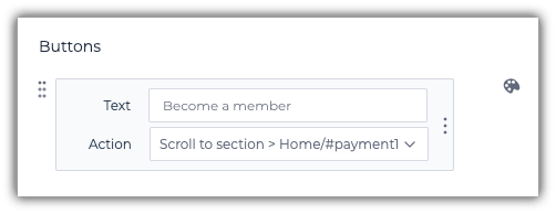
Our hero sections contain a 'become a paid member' CTA button. Let's configure it so that when pressed, the page automatically scrolls down to the pricing section. Make sure to implement this action for both hero sections (the one for guests as well as logged-in users).
The configuration should look like this:
Headers
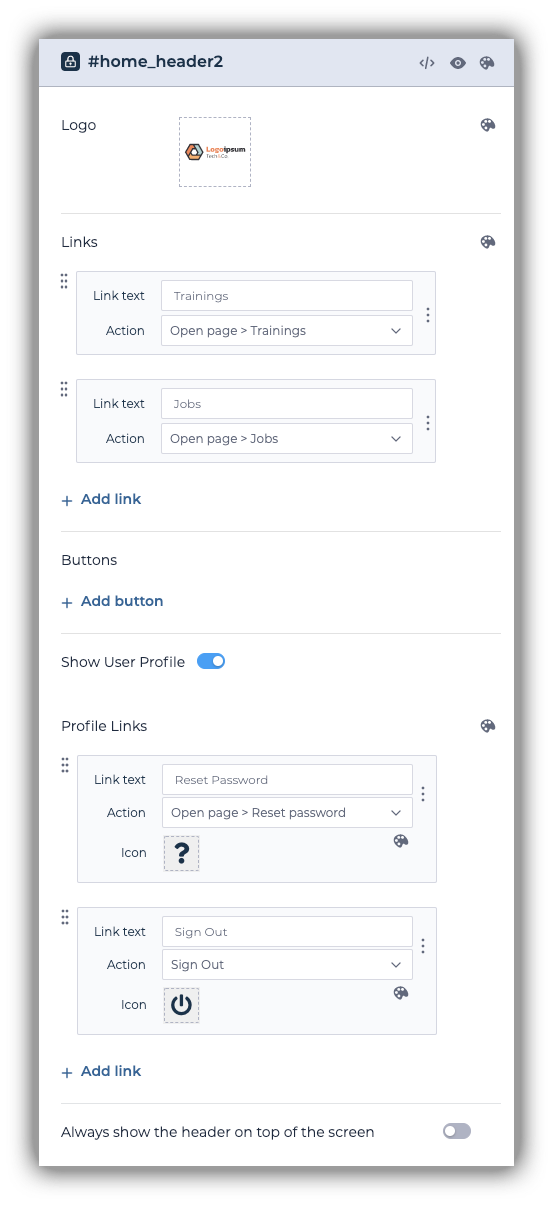
Let's configure the links in our header so that they point to the corresponding pages. Below is a list of the links that need to be configured.
Guest header
- Sign-in
- Become a member
- Like the hero section, this button should take the user to the pricing section on the home page.
Logged-in user header
- Trainings
- Jobs
- Forgot password
Our configured (logged-in user) header looks like this:
Footer
By default, most footers come with a few links. Feel free to delete any links that aren't relevant to your website, you can always add more later. Our footer links to no other pages.
Sign-up page
On the sign-up block, configure the sign-in button to redirect the user to the sign-in page.
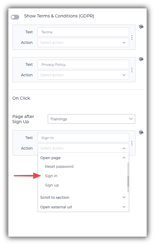
After a user signs up, there are a few things we can do. For example, we can redirect them to the page that contains resources that are available for free, but we can also redirect them to the home page to try to convert them to paying members. We've opted to send them back to the home page.
Sign-in page
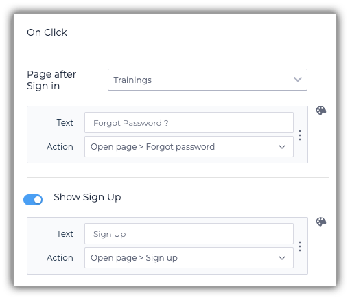
Link to the forgot password and sign-up pages from the sign-in block. The configuration should look as follows:
Checkout page
After a user has completed their checkout, they should be redirected to a page that makes sense. We've opted to send users to the Jobs overview page, which holds our gated content. Alternatively, you could create and redirect users to a thank you page.
If a paid member visits this page, they'll be shown a section that shows they're already a paying member. Configure the button to take them to the page that holds your paid content. In our case, that's the Jobs overview page.
Finally, update the Page after Sign-up field of the sign-up block. Point it to Checkout (sign-in).
Trainings overview page
Configure the on click of the list block to open the Training detail page. Now, when users click on one of the cards, they will be redirected to a page that shows more details about that particular record.
Jobs overview page
Like the Trainings overview page, configure the on click of the list block to open the Job detail page.
Test the website
Now that you've built the features of your website, it's time to test your website. This is a crucial step of the software development process, so take your time. The goal here is to find anything that doesn't work as you intended. In other words: try to break your own website.
Every bug you can find is one you've prevented a user from encountering. Make sure to test the sign-in, sign-up, and payment flows. Stripe has so-called test credit cards that you can use to test the payment flow. You can read more about that here. As you test, try to pay attention to block and page visibility. Make sure blocks and pages are showing and hiding when you expect them to do so.
We recommend fixing problems as soon as you encounter them.
Update content
Almost ready! You've arrived at the final section of the article: creating the content of your website. This chapter consists of writing copy, placing images, styling pages, and potentially SEO.
Copy
Having developed (and tested) the pages and functionalities of your website, it's time to provide your website with compelling content that will convert visitors into paying customers. Take the time to go through every page you've created and edit each text block to fit your needs.
Two increasingly important parts of every website are SEO and socials. People rarely type your website name directly in the address bar of their browser. Instead, they often end up using a search engine, or they get linked to your website from another platform. Visit each page's settings, and adjust the SEO and social settings for every page.
Undoubtedly, a big part of your community will be the resources kept in your Airtable base. If you want to dynamically populate the SEO settings of the detail pages of those records, check out this article.
Another important aspect of a modern website is accessibility. SEO algorithms take in many factors to automatically judge the quality of your website. Alt-texts for images is a must-have for modern websites. They allow bots and website readers (for visually impaired people) to better interpret your website.
Visual content
If you've written all the content and updated the page settings for SEO and socials, you've arrived at the final step needed in the creation of your gated community: uploading images and styling your website.
Modern website design can be a difficult and arduous process. Fortunately, Softr's pre-made blocks go a long way towards making your website look good. Feel free to apply any styling changes to your website to make it look exactly how you want.
Publish your website
If you've made it this far in the article, congratulations! You're ready to publish your website. You can follow this guide to publish your site to a custom domain.
Closing thoughts
In 7 steps, we've taught you how to build a paid member-only website. Hopefully, you've learned many things about web development and Softr. If you have any questions, we have an active Softr community where you can ask them. Good luck with your community!